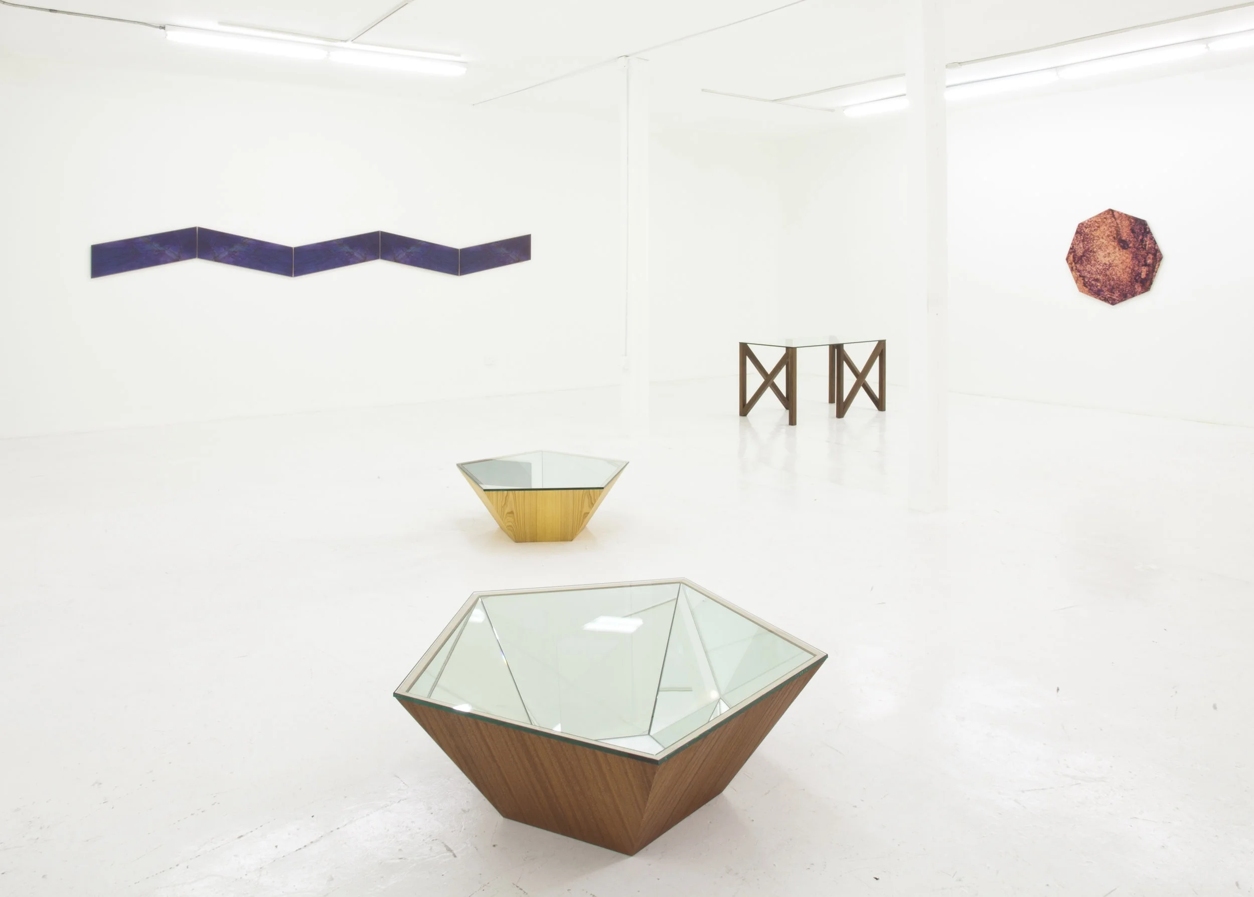
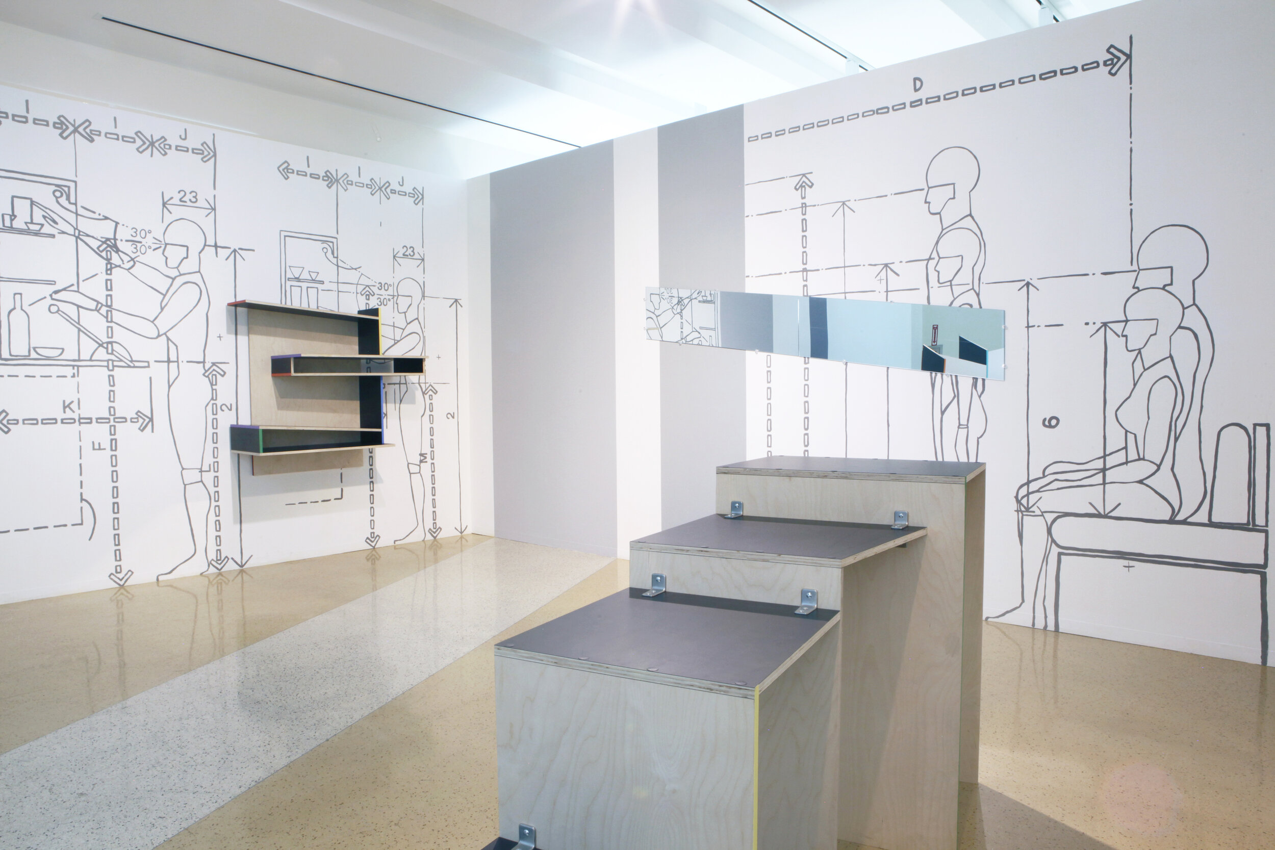
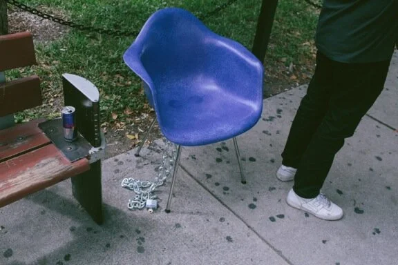
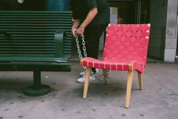
“In his 1993 essay “It’s Hard to Find a Good Lamp,” Donald Judd asserts the complicated relationship between furniture and art object: “If a chair or a building is not functional, if it appears to be only art, it is ridiculous. The art of a chair is not its resemblance to art, but is partly its reasonableness, usefulness and scale as a chair.” For Judd, these things certainly co-existed, and it is possible to trace the inf luence from one to the other. Similar to Judd in regard to his furniture, Emmett Moore has placed function at the fore. His pieces in the main space at Gallery Diet are meant to be interacted with, and are ultimately designed as pieces for the domicile.
There is an inevitable distress, then, with how to read them in a gallery. When considering these editioned pieces against an art-historical backdrop, relationships to Formalism and Minimalism can be easily conjured. With regard to design, they deploy Modernist influences that break tradition via clean pragmatism. Moore perhaps quotes histories to acknowledge and depart from their trappings and open a new conversation less preoccupied with polarity. He uses their overlapping attributes to his advantage to probe a deeper underlying phenomenon.
Interested in sculptural problem solving, function, and fabrication, Moore reduces tables, hanging lights, and wall tiles to smart and basic forms. Computer rendering programs can allow for a certain level of fantasy: you can skew the perspective, apply surface treatments, select and perfect, just by sending commands.
Transcribing this to the physical construction process presents a set of challenges and absurdities. With “Sliced Parallelepiped Lights” (2012) and “Rainbow Bookmatches” (2012), the discrepancy between the rendering and the real objecthood is cleverly self-evident. The boxes surrounding the lights are constructed as though they were 2-dimensional drawings made to look like 3-dimensional objects. From one angle they appear square, but up close they are actually impeccably constructed parallelogram boxes. “Rainbow Bookmatches” (2012) applies a different aspect of illusion. Bookmatching is a technique where a material such as wood veneer or marble is mirrored to create a facing pattern—like a Rorschach test. Here, the bookmatching occurred in the rendering first, and then the overall shape of the wall tiles was skewed. It is not real marble slabs but a digital image of mirrored marble pattern printed directly onto the wood; otherwise, the shapes and relative patterns would not match. Moore’s obvious use of an artificial façade provides the sophisticated framework of Surface Tension. A reverse trompe l’oeil is imposed on objects in the form of mica, print, or veneer as an indicator that taps into a long cultural history of building, design, and status.
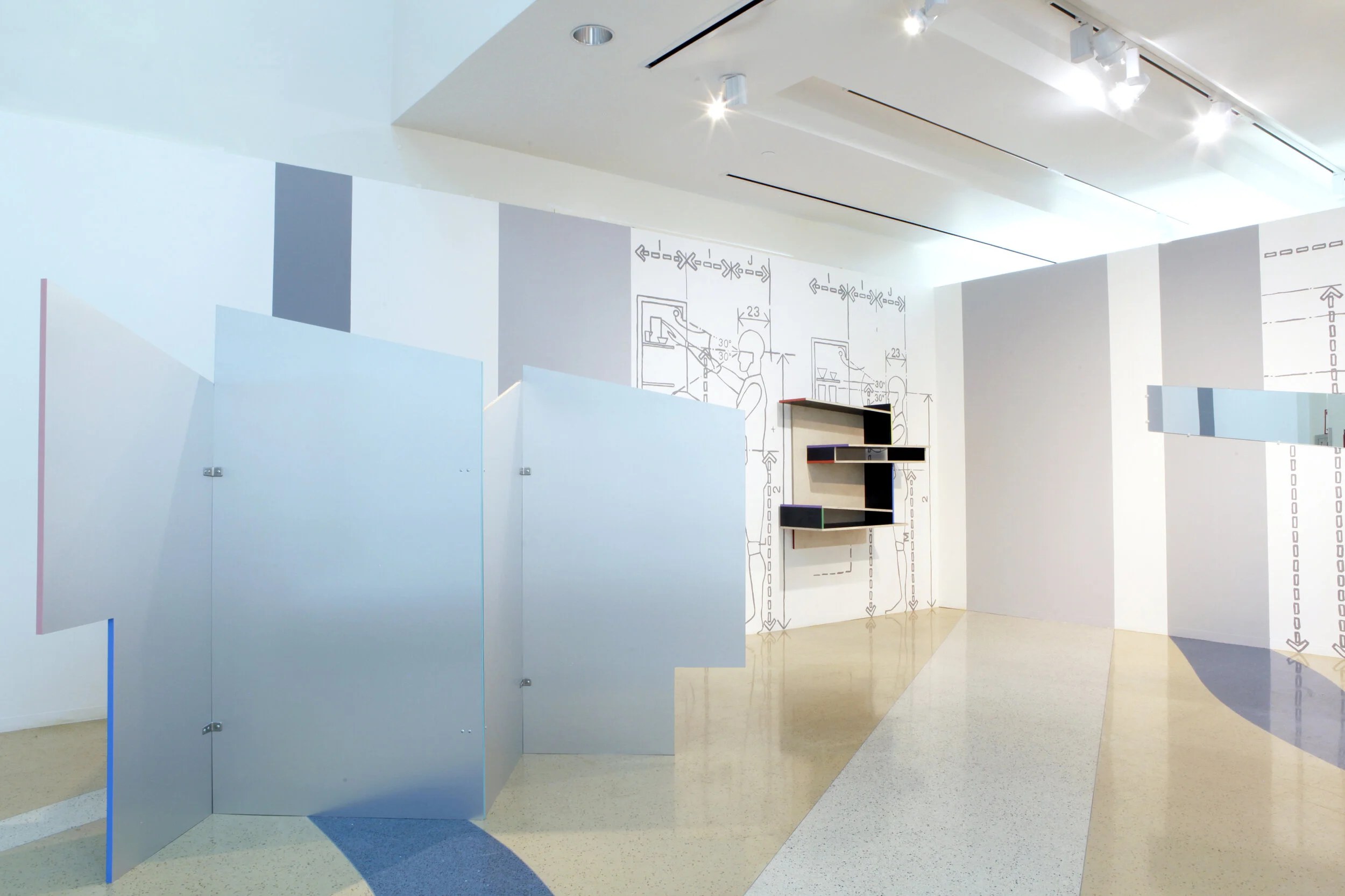
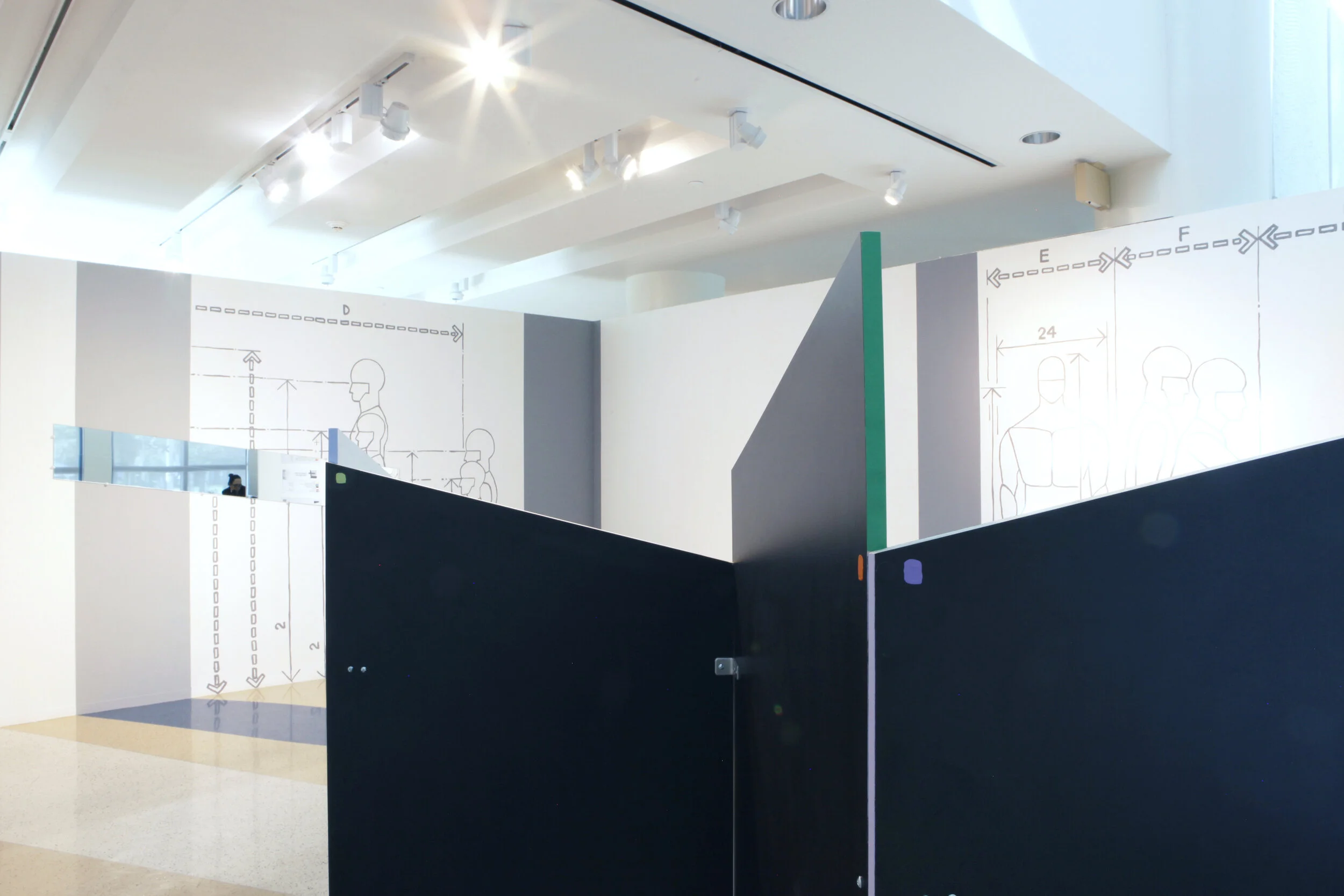
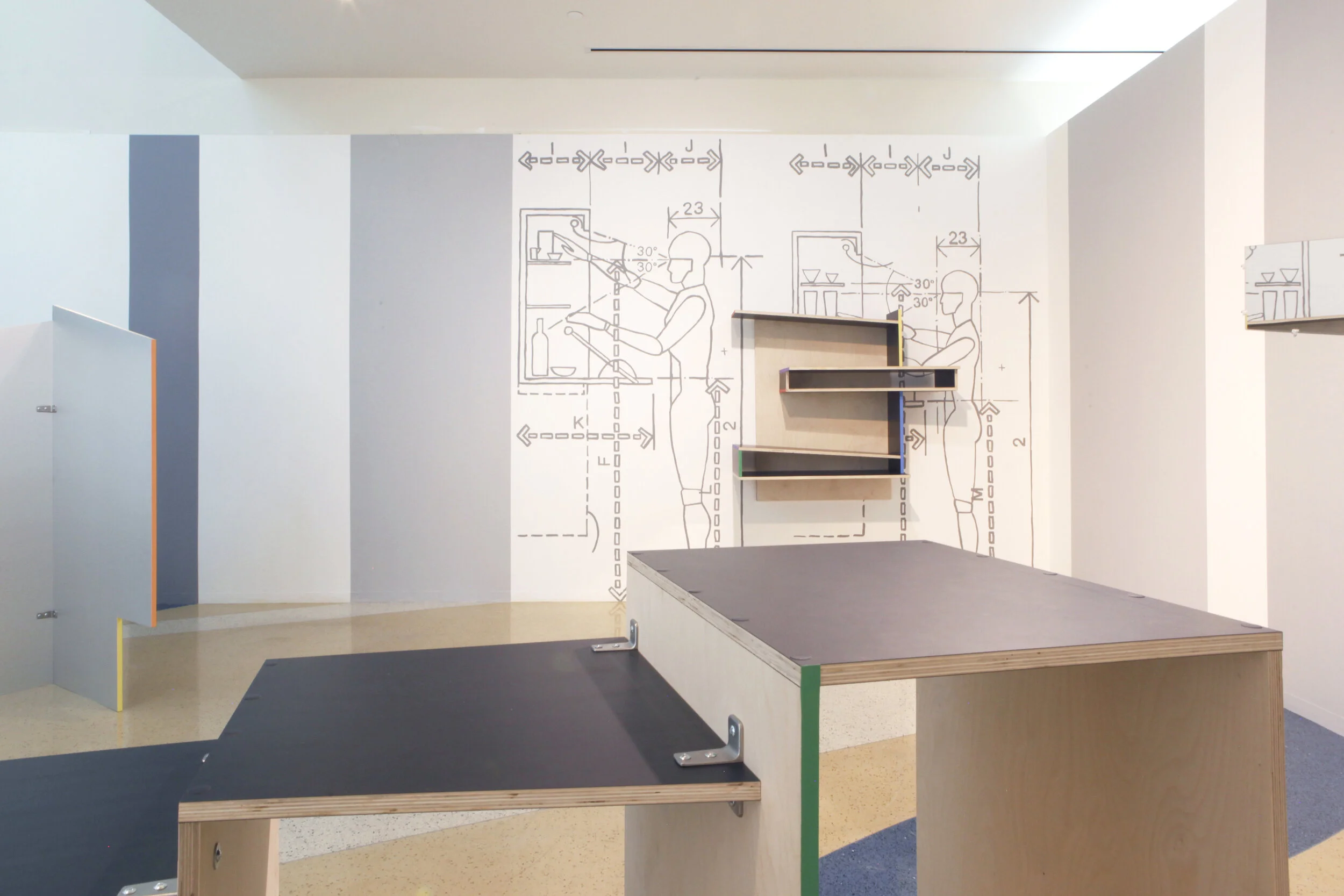
In the project room, a series of collaborative works between Moore, and RISD classmates artists Chris Johnson and Connor Klein establishes a link to the artistic process. Styrofoam, models, and misleading plays on material are the visual jokes, the “how it’s made,” the truthful remnants of the distilled forms in the main space. This appendix lends supplemental meaning to Moore’s other objects, where they otherwise (especially in proximity to Miami’s Design District) might be accepted or dismissed as just sleek furniture pieces in a show room. This discussion about the tendency in design to cosmetically obfuscate the components of domestic and architectural objects is effective and important to reading the show. It is a very sophisticated conceptual dimension that might have otherwise eluded viewers; the furniture’s mere presence in the gallery space would not have been enough to open that critical conversation. Perhaps, then, Surface Tension offers insight not only into Moore’s practices, but also into the tension between the domestic and the gallery, functional and aesthetic, real and simulated.”
Cara Despain - The Miami Rail


